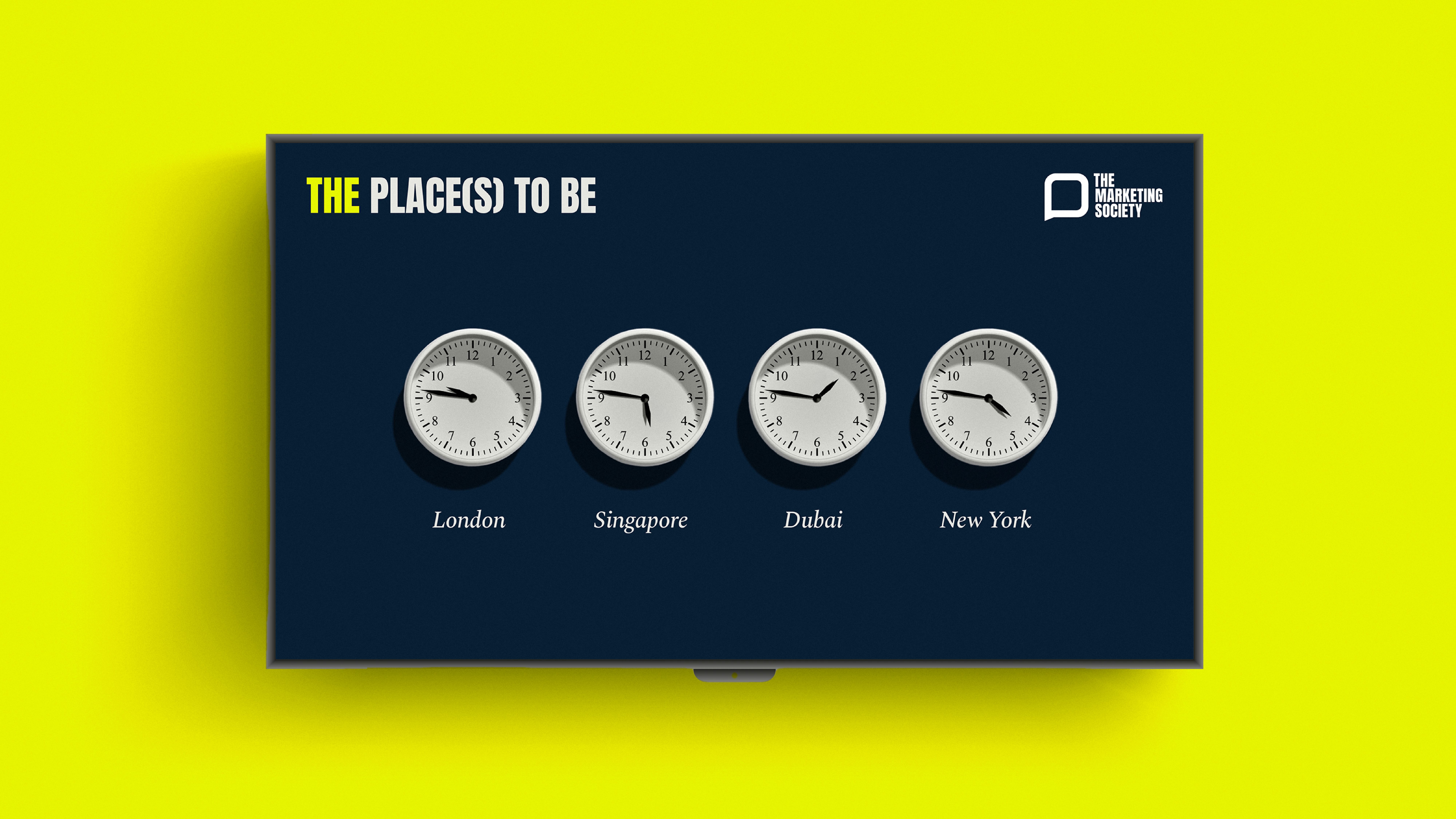
The Marketing Society celebrates refreshed visual identity created by Design Bridge and Partners

The Marketing Society has unveiled a refreshed bold, streamlined identity, created by our London studio, reinforcing its position as the undisputed global authority in marketing leadership.
We placed visual emphasis on the definitive “THE” in its name, underscoring the unique power of The Marketing Society’s community to inspire, influence, and move the world.
Retaining the brand’s established speech bubble logo, we introduced a refined, vibrant colour palette that reflects the brightest voices in marketing. Combined with confident typography and a distinctive imagery style with bold visual metaphors that fuse vibrant symbolism with direct black-and-white photography, it works in harmony to deliver globally resonant, inclusive communications. Creating an identity that showcases sophistication and clarity, vividly embodying the brightest and the best of its members.

“At The Marketing Society, we unite and uplift marketing leaders to accelerate business growth and shape a better future for our industry, our businesses and our world. Our refreshed bold identity now proudly positions us on top, as the global marketing community, made up of the brightest voices in the industry who truly mean business. We are thrilled to have partnered with Design Bridge and Partners to bring this vision to life and help us create a brand that truly reflects who we are and where we’re going.”
— Sophie Devonshire, CEO of The Marketing Society
“Our goal with The Marketing Society was to strike a careful balance: boldly evolving its brand identity to emphasise its authoritative status, while respecting core aspects of an established visual heritage.”
— Katherina Tudball, Senior Creative Director, Design Bridge and Partners


