The Archer School For Girls in Los Angeles unveils new brand identity, created by Design Bridge and Partners

The Archer School for Girls reintroduced itself to the city and the world with a new brand identity, marking a significant milestone for the Los Angeles-based school devoted to intentional education through which girls discover and pursue their individual excellence. Developed in partnership with Design Bridge and Partners, the rebrand extends what has long been seen, felt, and celebrated inside Archer’s gates, with a visual identity that seamlessly combines the classical and modern, symbolizing the school’s distinctive position at the intersection of traditional and contemporary education.
The world has unwavering, often cunning demands of girls, such that girls’s needs are all at once specific, nuanced and constantly evolving. In the spirit of this constant change, the new identity reflects Archer’s innovative and iterative approach to education, which includes, among other things, its embrace of emerging research-based education models, relationship-based learning, and purposeful risk-taking.
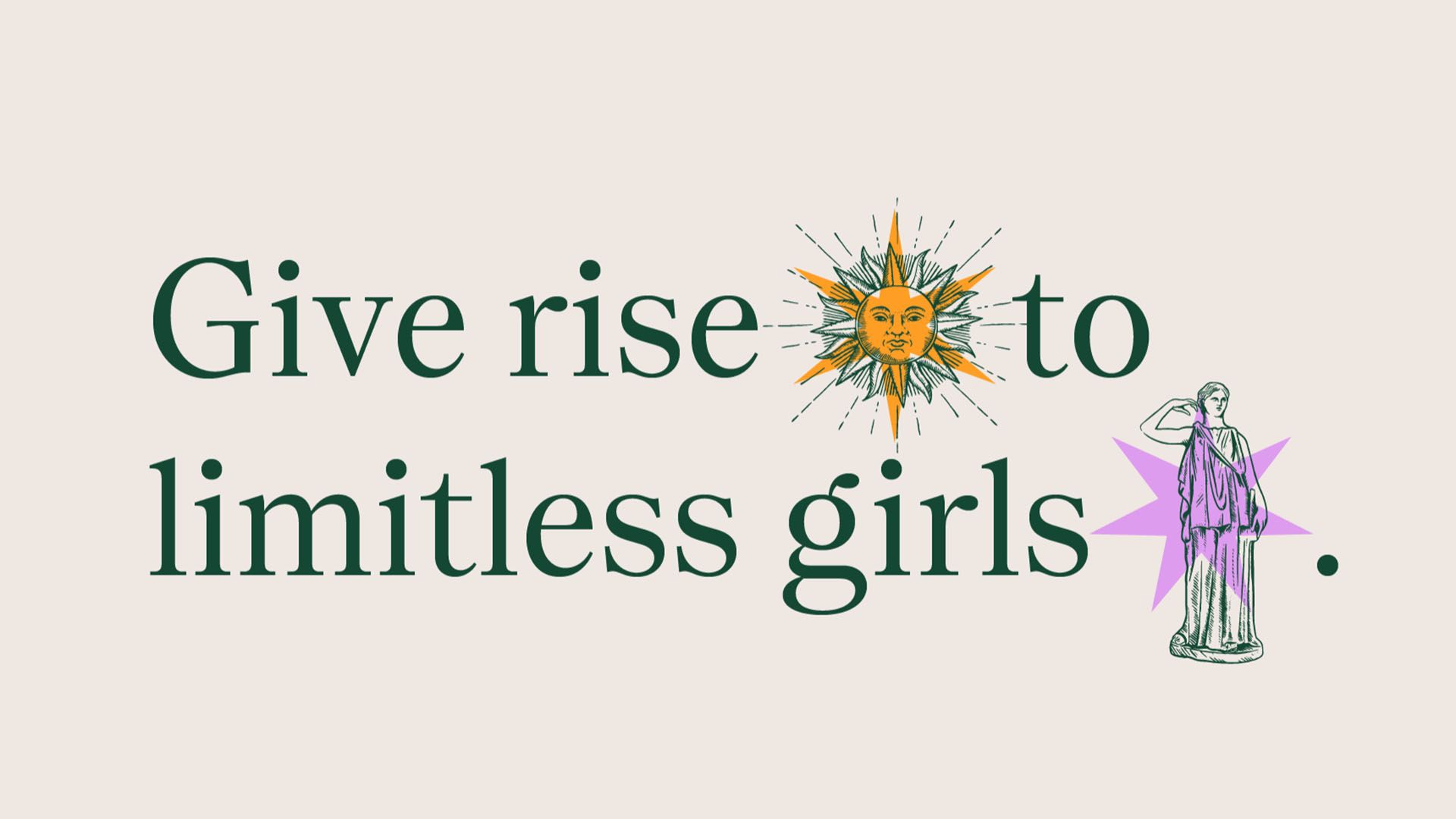
Driven by three key themes – “Vibrant”, exuding youthful energy and boldness; “Sharp”, blending edge and elegance; and “Unstoppable”, reflecting a commitment to strength and passion in reimagining all-girls’ education – the identity aligns seamlessly with Archer’s mission to nurture the fearless inquiry, compassion, and resilience girls need to pursue their brilliance. The brand evokes the symbolism of Artemis, from Greek mythology, and the “aegis”, a protective shield, reflecting how Archer fosters an intentional and secure environment where girls can thrive.
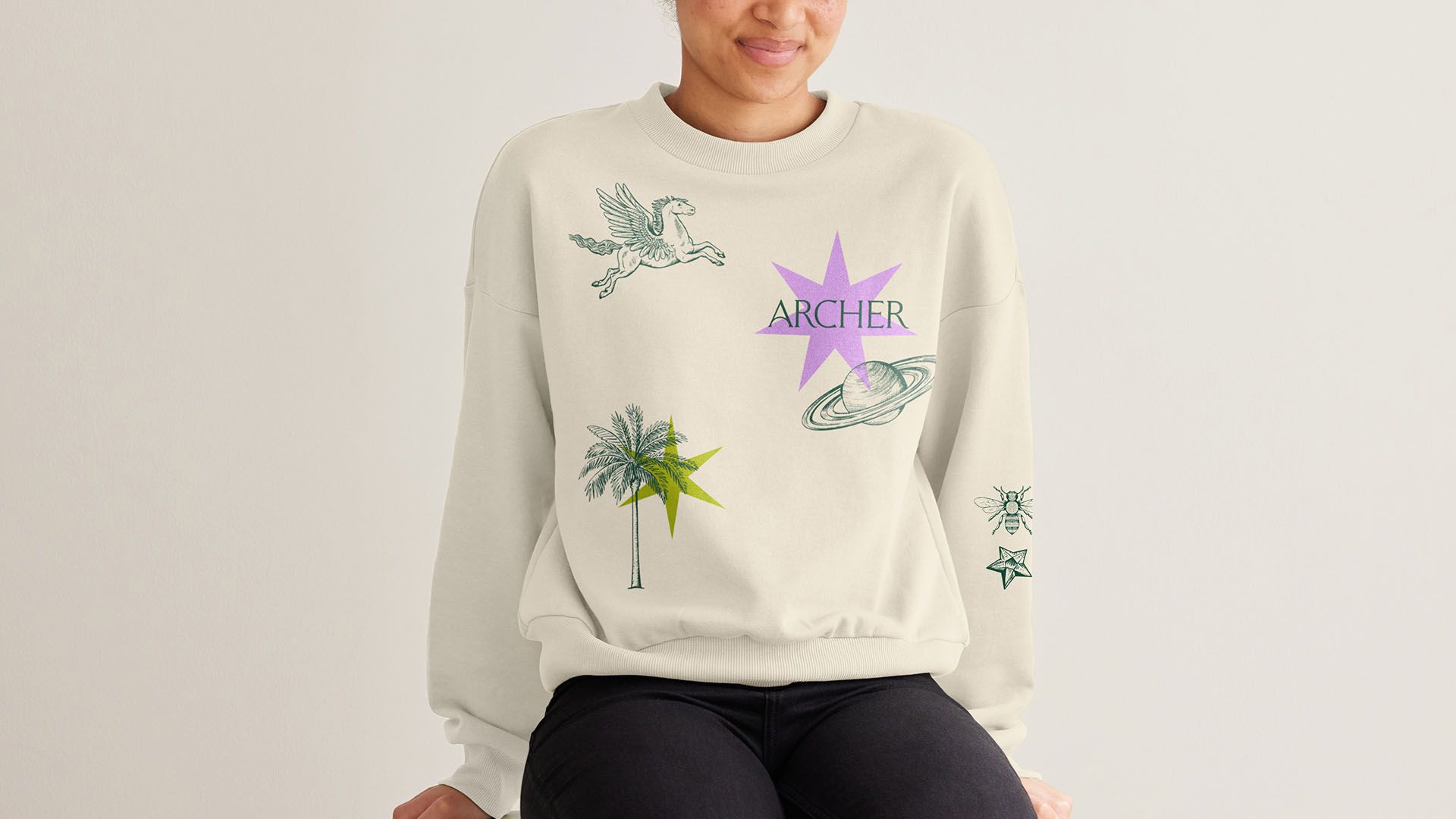
At the core of the visual identity is “The Archer”. Inspired by Artemis, The Archer represents each student, aiming for her goals. Elsewhere, constellation elements have been incorporated within the identity. The students’ goals are as varied as the stars, calling for a system of icons that represents their breadth. The Archer is always aiming up towards one of these goals. They underscore Archer’s encouragement for girls to shine brightly and pursue their unique brilliance. These elements are paired with Star Elements, which bring vibrancy and modernity, while gravitational elements, such as “The Fountain”, “The Palm”, “The Maypole”, and the School’s unofficial mascot “Alfie” the dog, each represent facets of both its identity and the community it serves.
The primary colour palette of Stone and Evergreen symbolize foundational support and growth potential, while secondary colours of Palm, Pink, Sunset and Sunrise represent new growth, the divine feminine, Los Angeles sunsets, and the limitless potential of Archer.
We developed a photography style and imagery that capture active and engaged learning moments, emphasizing the feelings of “aha” and awe, while showcasing the joy, passion and character which are core to being an Archer girl. It further highlights the school’s commitment to creating a vibrant and positive learning environment.
Rooted in the school’s core principles, Archer‘s new brand emphasizes the significance of joy as a fundamental catalyse for ambition, encourages reflection, champions the exploration of personal edge, prioritizes effective teaching, and nurtures imperative leadership skills.

“When I met the folks at Design Bridge and Partners, I immediately knew that they were for Archer,” says Elizabeth English, the Head of School at The Archer School for Girls. “Design Bridge and Partners instantly understood that Archer occupies a category of one, given our balancing of a strong, liberal arts education delivered with dynamic, research-based approaches.”
“At first glance, Archer’s new brand evokes a traditional, prestigious school – the evergreen and stone colour palette, the carefully crafted wordmark and classically illustrated icon,” shares Marlee Bruning, Creative Director at Design Bridge and Partners. “But then you look a bit closer and you see that this isn’t your average school – you see the vibrant colours cutting through, the dynamism of a moving logo, the modern content of the icons. The design reflects the school and its unique iterative approach to education – always researching, reflecting, adapting – it takes what’s great about classical education, and marries it with a cutting-edge modernity.”
“Design Bridge and Partners brought a fresh perspective to our needs as a girl-serving non-profit,” English continues. “Their all-female team discerned astutely not only our market but the generational perspectives of our students and families as well.”
“Archer possesses a unique ‘glow’ that awes its families and gifts its girls a signature striking brilliance,” says Veta Bates, Senior Strategy Director at Design Bridge and Partners. “To serve the school, the girls, and the world, we set out to extend that ‘glow’ well beyond its gates.
“We brought to the forefront some of Archer’s most impactful and resonant truths, and then found a way to express them with such clarity and distinction that when you encounter Archer in the broader world, you will feel its glow too, as well as the boundless potential it offers its girls, and the way Archer can inspire possibilities for education at large.”